From Facebook DMs to 2,000+ orders a month.

NYLA Care is a Tunisian wellness brand selling a natural deodorant cream formulated around black seed oil. Before the project, buying meant messaging the team, asking a list of questions, and only then deciding. The job was to turn that conversation into a purchasing experience.

2,000+ Orders per month
~40% Of orders through the site
2+1 Bundle offer, made obvious
1st Mobile-first, by default
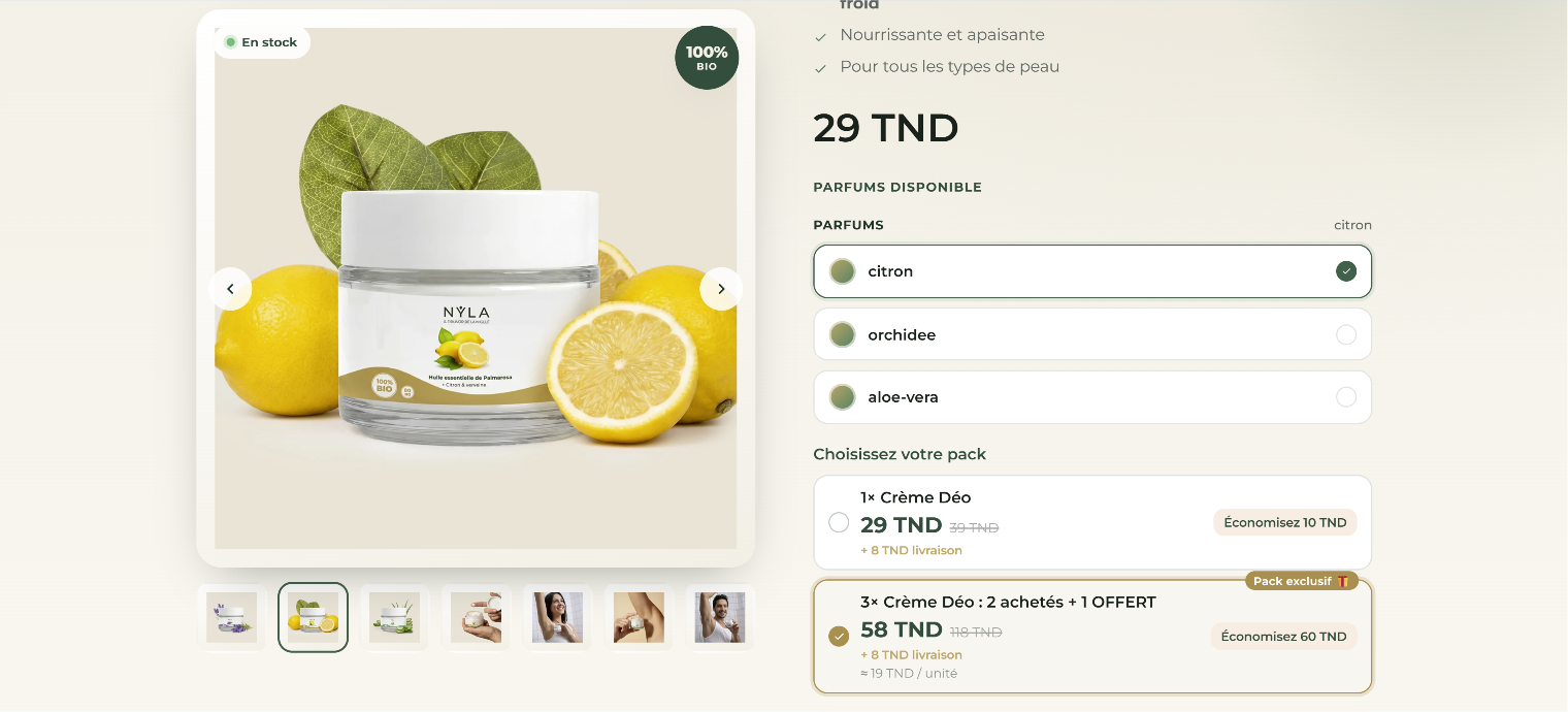
NYLA Care Shopify product page showing the natural deodorant cream, fragrance selection, price and the 2+1 bundle offer
NYLA Care · product page · fragrance and bundle selection
The challenge

The product sold. The process did not scale.

The journey ran: discover on Facebook → contact the team → ask questions → understand the product → decide. Every sale required manual interaction, and every customer asked roughly the same things.

The challenge was never simply to build a website. It was to build one that answered those questions before anyone had to ask them.

The CRO vision

Clear product. Clear benefit. Obvious next step.

Rather than forcing customers into a conversation, the site was designed to deliver the information they needed inside the purchase journey itself.

The focus was clarity and simplicity — not more features, more sections or more persuasion.

The build

Structured around the questions customers actually asked.

Every section of the site exists because a real customer kept asking for it in a DM.

01

Understand the product

The hero introduces the Crème Déo immediately — positioning, benefits, rating and price, without a scroll.

02

Understand the value

Benefits and key characteristics explained on the page instead of relayed one message at a time.

03

Explore the formula

An ingredient section explaining what each component does, so customers can see what makes the product different.

04

Build trust

Reviews, verified-purchase indicators, ratings, delivery information, payment options and return policy — uncertainty removed at the point it appears.

05

Compare

A comparison section giving visitors a second way to understand the difference between NYLA and a conventional deodorant.

06

Choose & order

Bundles presented so the value is legible at a glance, then fragrance selection, details and cash-on-delivery checkout in one flow.

Decision · 01

Mobile was the primary surface, not a breakpoint.

Customers were already discovering the product on social media, which meant most of them arrived on a phone. The experience was designed around prominent CTAs, simple navigation, a clear information hierarchy and easy bundle selection.

Someone arriving from a Facebook post should be able to understand the product and order without navigating anything.

Decision · 02

The offer was not the hard part. Making it understandable was.

Instead of asking customers to work out which combination gave the best value, the site presents the options directly. The 2+1 bundle gives a clear reason to buy more than one unit and raises the value of each order.

Creating the offer took an afternoon. Making it immediately obvious took the design.

The result

A sales channel, not a brochure.

NYLA Care now generates more than 2,000 orders a month, with roughly 40% coming through the website. Customers evaluate the product, understand the offer and order without needing the team to answer a single question first.

What we shipped
Strategy
CRO journey, IA, offer presentation
Design
UI/UX from scratch, mobile-first
Build
Shopify, custom theme implementation
Commerce
Bundle experience & order flow
Performance
Responsive optimisation

Order volume and channel split are values reported by NYLA Care.

The takeaway

Good CRO is not adding more. It is the right information, at the right moment.

NYLA Care’s real problem was never the absence of a website — it was friction in the buying decision. Turning the questions customers repeatedly asked into information they meet as they browse made the whole thing simpler, more intuitive and finally scalable.

Same problem?

Wellness brands selling in the DMs.

If your team is answering the same five questions before every sale, that is a design problem with a measurable cost. A 30-minute call is enough to find where the friction sits.